Dashboard:
For Small
Business
Owners
I led the end-to-end design of the dashboard, from defining problems to executing on visual design refinement, to working with engineers to polish the final MVP. Webveloper is a startup helping un-silo the working of multiple tools for SMB.
Team
1 PM
1 designer
5 engineers

Role
Lead Product Designer
Problems
Local small business owners struggle with admin works and deadlines while juggling between different tools to manage their business
Scope & Timeline
Four months
Solutions
Provide small businesses the birds-eye view of their business: a dashboard where SMB can access all tools and digest notifications on a real-time basis.


CONTEXT & STARTING POINT
The current wireframe doesn't meet the needs of stakeholders
I picked up the design from the wireframes left by the previous designer. The engineers and PM in the team were not satisfied with the current flow. The first thing I did was to scope down the spec doc and talk with teammates in order to better understand the goals for the dashboard.
Goals:
1. Drive user engagements throughout all the tools (e.g. business website editor)
2. Dashboard is an all-in-one place where users can manage every aspect of their business and read the latest notifications in one place
3. Dashboard experience will be modular, expandable, customizable, and scalable
4. Dashboard will include notification feed instead of metrics for beginner-friendly purposes
Old Dashboard Wireframing


PROBLEMS
Analyzing the current designs and defining priorities
While analyzing the current design, I discovered some usability problems. In addition to that, the style consistency across other products of the company was not defined yet.

Dashboard wireframe

Website Editor Hi-fi Design
Problem #1:
Style and component inconsistency across all products
Website editor design, one of the tools that are accessible from the dashboard, was already a work in progress, eighty percent done. However, the dashboard design is only fifteen percent done.
Need:
Keep the branding, style, color guide, and components consistent across all products.
Actions:
I set up meetings with the two other designers and the PM to define the shared master style guide, color palette, and components that we will use everywhere in future development.
Old Editor Top Bar
Old Dash Top Bar
New Top Bars
Old Style Guide

New Style Guide

Problem #2: Usability Issues
Need:
A refreshing change to achieve the business and user experience goals
Actions:
1. Analyze the current designs and find the usability issues
2. Conduct UX research (user testing and interviews) with existing and potential customers
3. Conduct competitive research about dashboard design
4. Define the user needs

-
Defined global Top Bar
-
Further optimized side bar for tools
-
Separated To-do list into existing tasks and new tasks
-
Better notification layout
-
Improved hierarchy
-
Fixed module consistency
-
Moved To do list CTA to the top
-
Changed copy for better readability
-
Simplified Top Bar
RESEARCH
Insights from UX research
I conducted some user interviews and usability tests with six potential customers. The current mid-fi dashboard design turns out to be misleading for users to create tasks, stay updated, and manage their business.
Users do not understand how to navigate the dashboard in an efficient way.
User Needs: quick and easy, non-tech savvy, no coding, readymade do-it-for-you
1. Clear navigation of what's the use of each tool
2. Making it easier for local small business owners to digest the latest updates that need attention
3. Allowing users to take quick and easy actions to GTD
IDEATION
Separate To Do List feature out of dashboard homepage
The initial design stacking To-do list on top of notifications can lead to various issues. Thus, I separated To Do List feature out and use notifications feed as the dashboard home for a pure focusing experience.
Usability issues solved:
1. The ability to browse past notifications becomes difficult when there are too many existing tasks above the fold
2. The lack of ability to view all tasks in a timeline
3. Users need to go to the top of the page to create a task


IDEATION
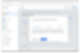
Add task flow at To-Do List
In able to let users make quick actions without being distracted. I provided two options to add a task: the quick add and add details options


Notifications feed refinement
I refined the design of the notification box of each tool for better scalability and to avoid too many edge cases.

VISUAL EXPLORATIONS
Exploring and defining visual design
I explored and created a mood board to better ideate on the direction of the visual design.
Keywords:
1. Simple and light
2. Not too playful and start-up like
3. Professional & reliable with a bit of fun


OUTCOME
Design Execution and Handoff
The final deliverable for the dashboard was the hi-fi design, master components, and interactive prototype.


REFLECTIONS AND LEARNINGS
Lead product design with empathy and intuition
1
When I first started on the project, I was aiming for a complex and multi-functional dashboard. After researching about the user groups more, who are local business owners, I shifted the direction to make everything as digestable as possible. I developed deeper understanding of what kind of feature can really accelerate people's working processes.
2
I gained valuable experience throughout the process of designing the dashboard from end-to-end. Working with an engineering-focused team within a tight timeline broadened my skills in leading design and cross-functional collaboration.
3
Due to the limitation of an early stage start up, I didn't have much time to conduct more in-depth user research to let more relevant data help with making the design decisions. I'd love to go back and iterate on the design if given more time.
4
There were countless obstacles that create inefficiencie during the engineering handoff process due to edge cases. By understanding how to collaborate and support the engineerng team, I gained new perspective on how I work and build products when I was the only designer in the team.